Education
What Is a Histogram?

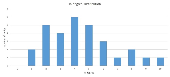
A histogram is a graphical representation of the distribution of data. It is created by plotting the frequency of data values on the vertical axis and the corresponding data values on the horizontal axis. They show the distribution of data by plotting the number of data points that fall within each interval on the x-axis and the corresponding frequency of occurrence on the y-axis. Now that you have a formal histogram definition, you can learn how to interpret them, how to create histograms, and more.
How do you read and interpret histograms?

Histograms are graphical representations of data, typically showing the frequency of data values within a given interval. They can be used to determine the distribution of data and to identify outliers. The x-axis of a histogram typically represents the data values, while the y-axis represents the frequency of data values. The area of each bar in a histogram represents the frequency of data values within that range. To read and interpret histograms, you should first determine the shape of the distribution. A symmetrical distribution will have a bell curve shape, while an asymmetrical distribution will have a more uneven shape. You can then identify any outliers, which are data values that fall outside of the normal distribution.
How do you create a histogram?
A histogram is a graphical representation of the distribution of data. It is a graph that shows the number of data points that fall within each interval. Histograms are used to help you understand the distribution of data and to identify potential outliers. To create a histogram, you first need to gather data. Then, you need to decide how you want to group the data. The most common way to group data is by intervals. You can create intervals by dividing the range of data into equal parts.
Read Also: SEO Management Companies: Why You Should Hire One
Once you have decided how to group the data, you need to create a table. The table will list the intervals on the horizontal axis and the number of data points in each interval on the vertical axis. Next, you need to create a graph. The graph will show the distribution of data. The horizontal axis will list the intervals and the vertical axis will show the number of data points in each interval. Finally, you can use the histogram to identify potential outliers. Outliers are data points that fall outside of the normal distribution.
What are some examples of using histograms in real-life application?

Histograms are an important part of statistics, and they can be used in real-life application in order to improve decision making. In particular, histograms can be used to compare sets of data, check the distribution of data, identify outliers, and judge the accuracy of data. When you have two sets of data, you can use a histogram to compare the two sets. This can be helpful in making decisions, for example, in choosing which set of data is more likely to be accurate. When you have a set of data, you can use a histogram to check the distribution of the data. This can help you to identify any patterns in the data and to make better decisions based on that information.
You can also use a histogram to identify outliers. This can be helpful in improving your decision-making, as it can help you to identify data that is not representative of the rest of the data. When you have data that is obtained from a sample, you can use a histogram to judge the accuracy of the data. This can help you to make better decisions about how to use that data.
Now that you know all about histograms, you can use them to analyze frequency distribution, data symmetry, and more.


![[pii_email_4c910535350b5a41ee81] Error Code Resolved](https://wigily.com/wp-content/uploads/2020/09/pii_email_4c910535350b5a41ee81-Error-Code-Resolved.jpg)
